NOV 2024 - BRAND RENAISSANCE
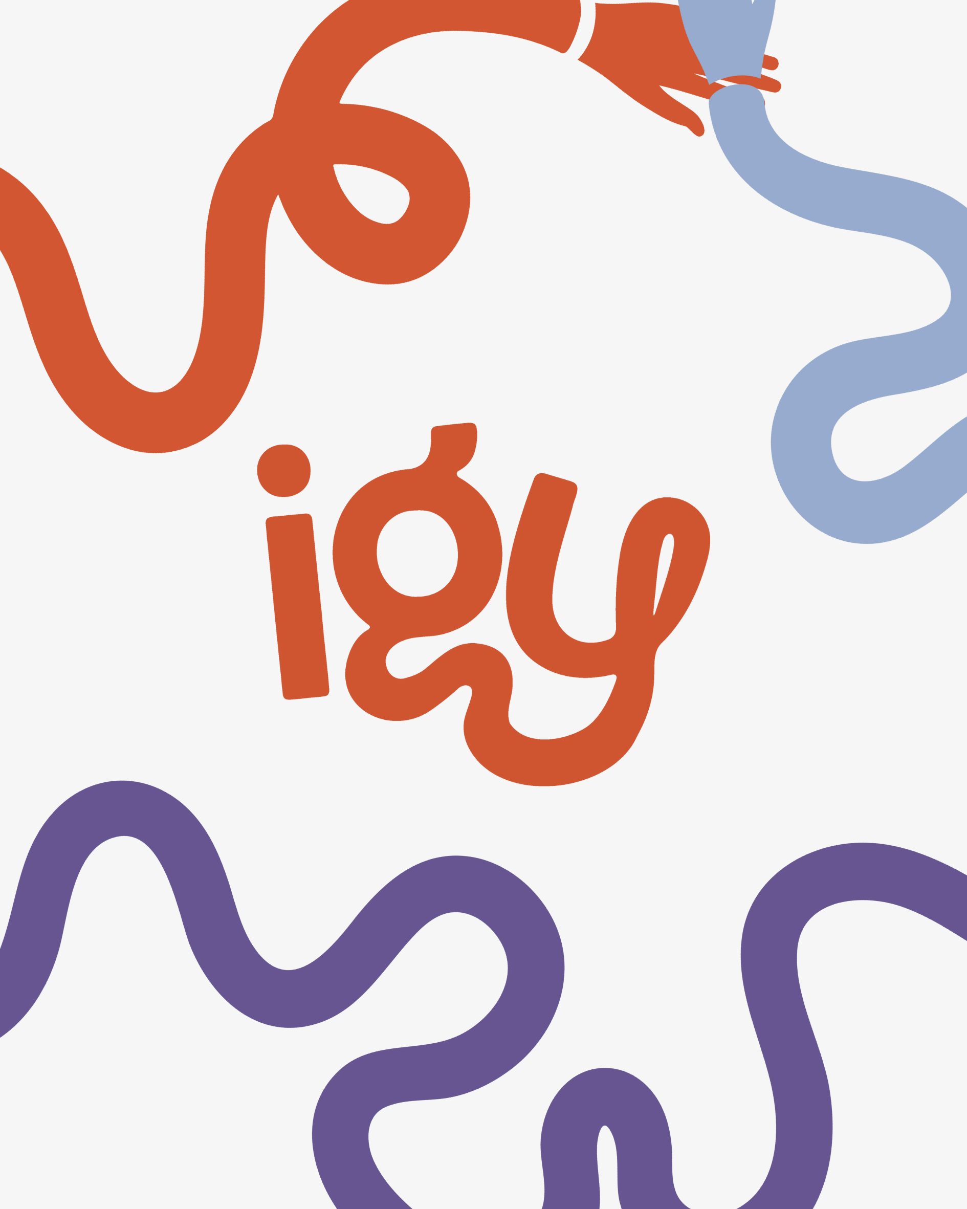
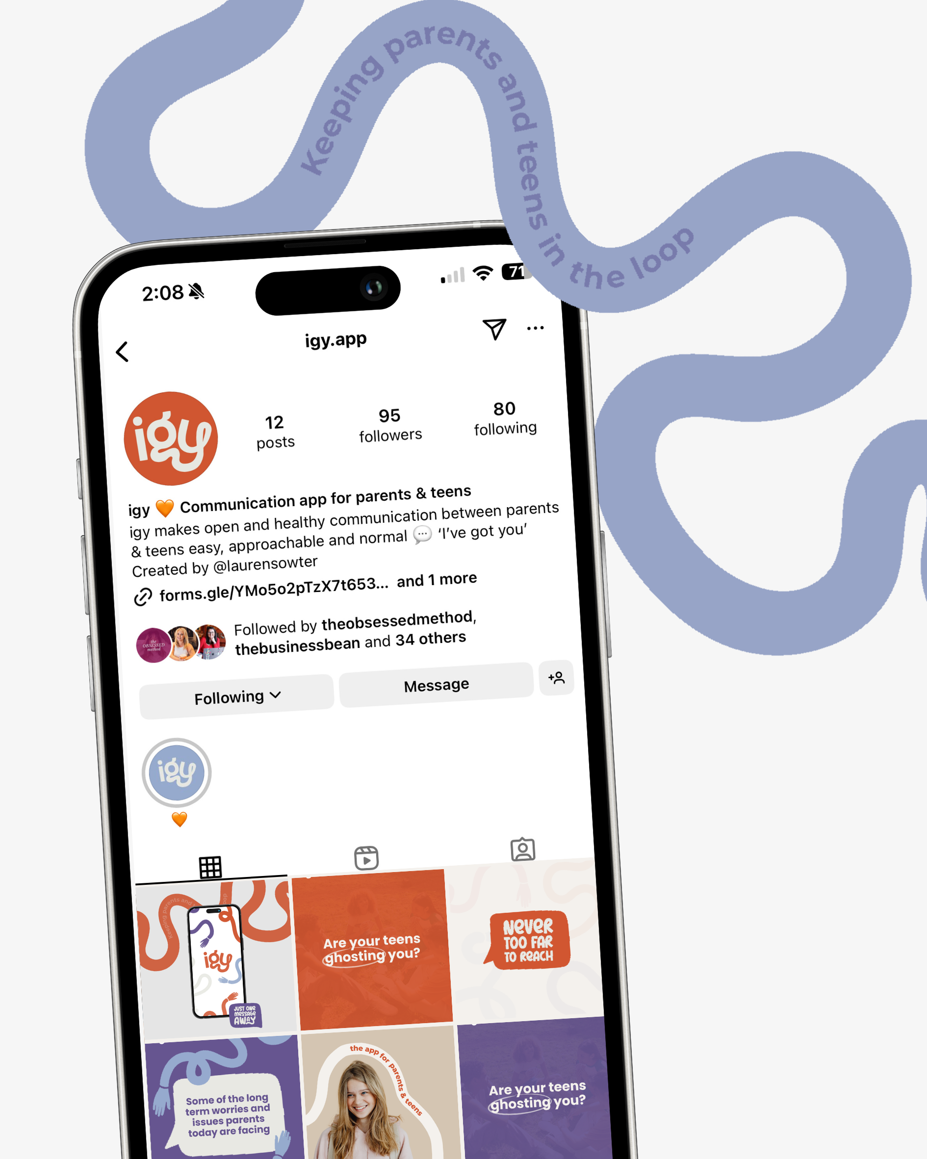
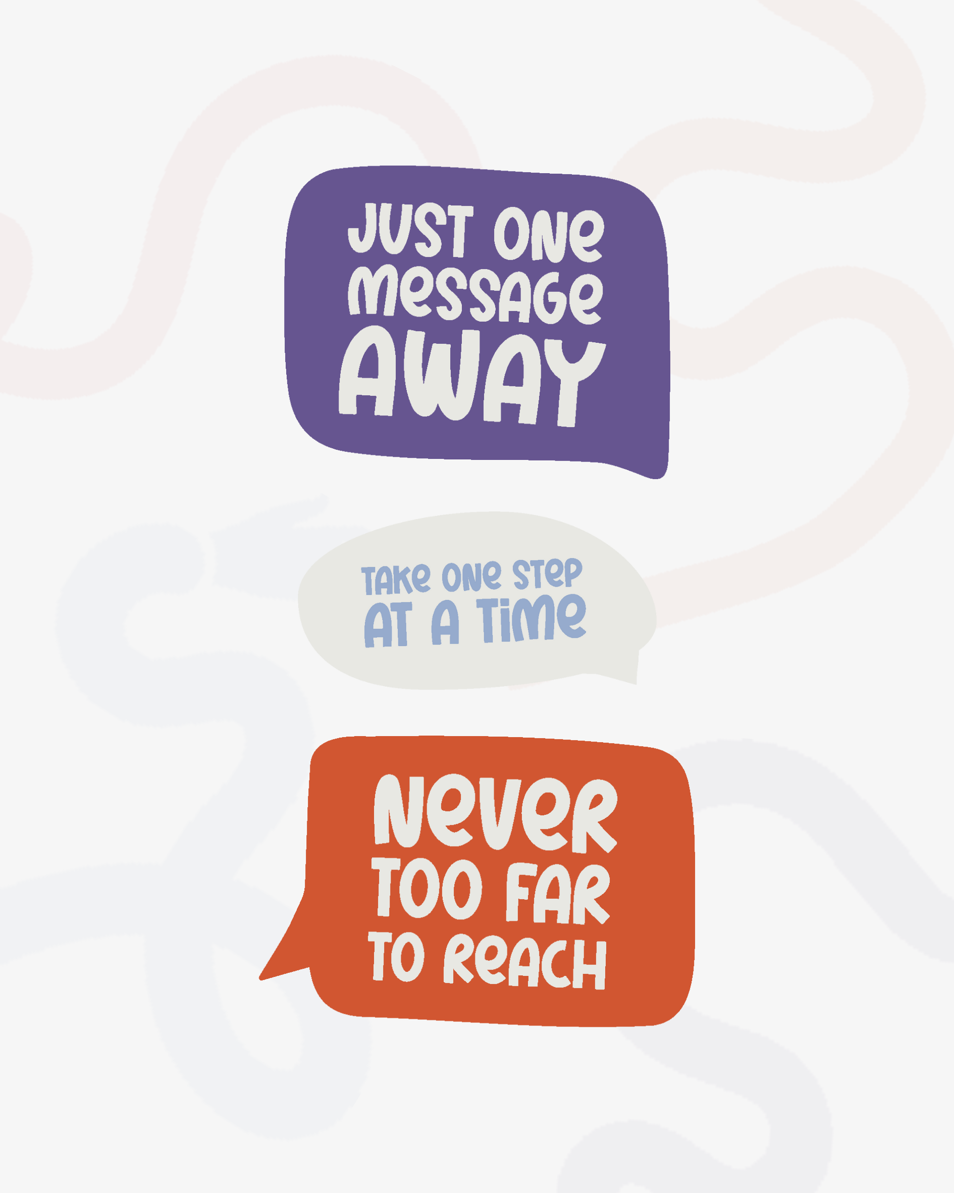
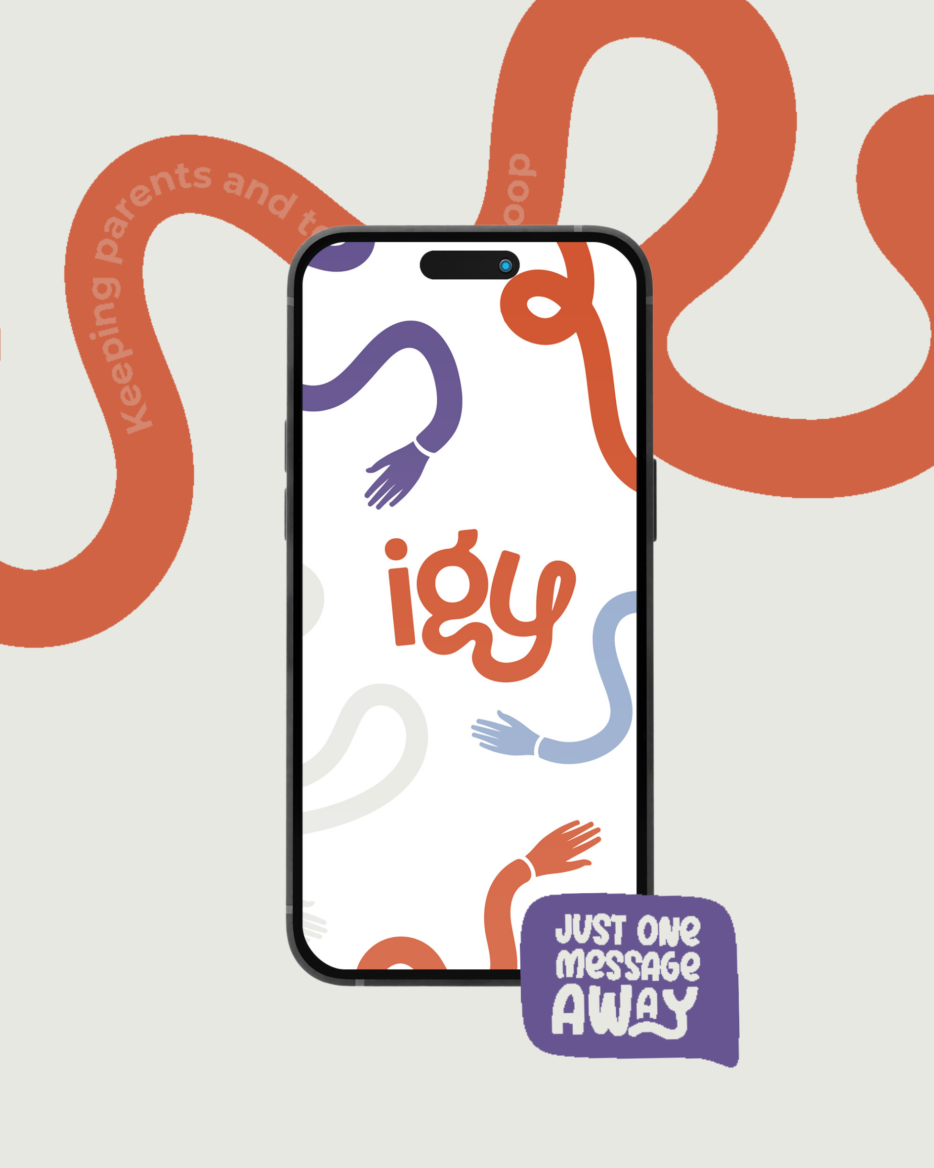
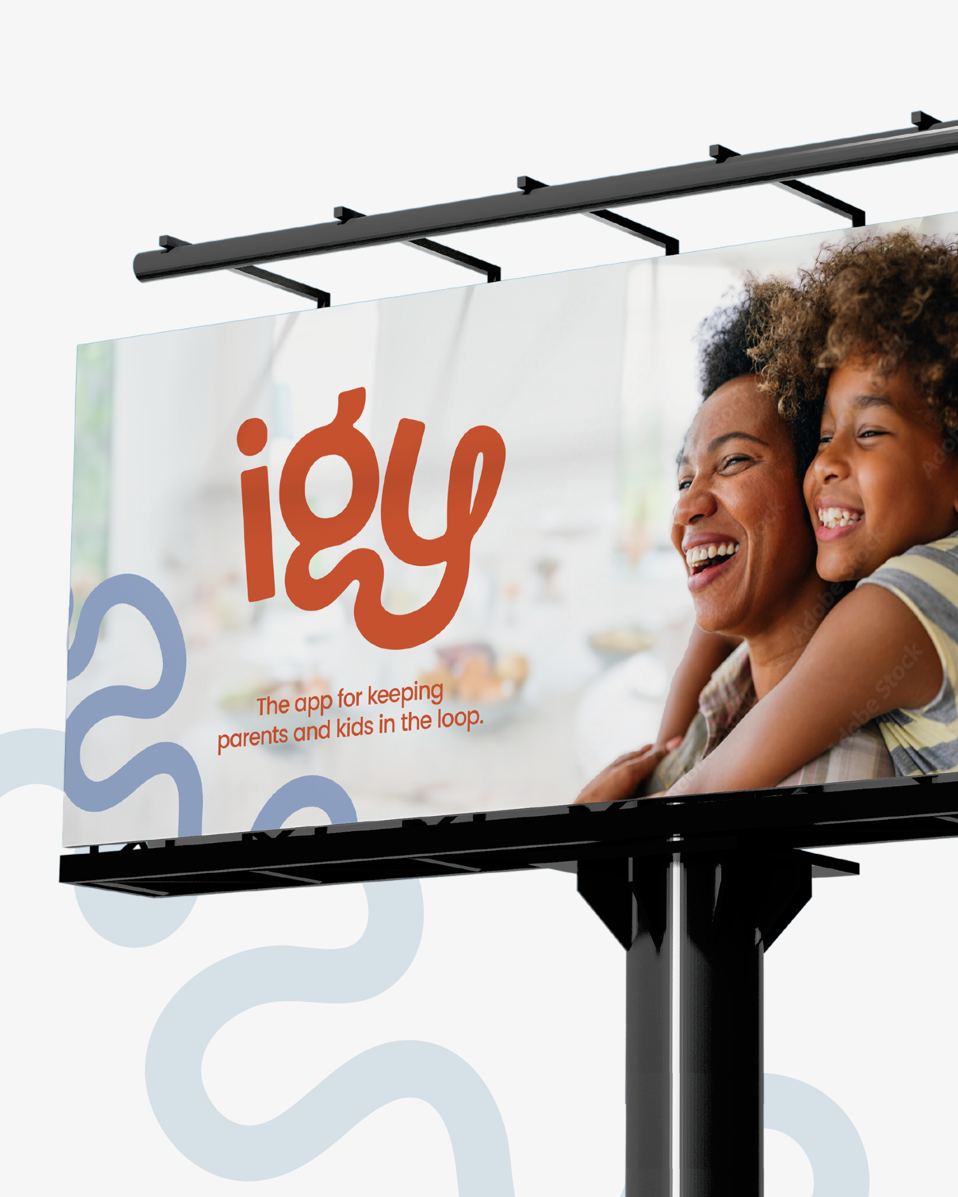
igy
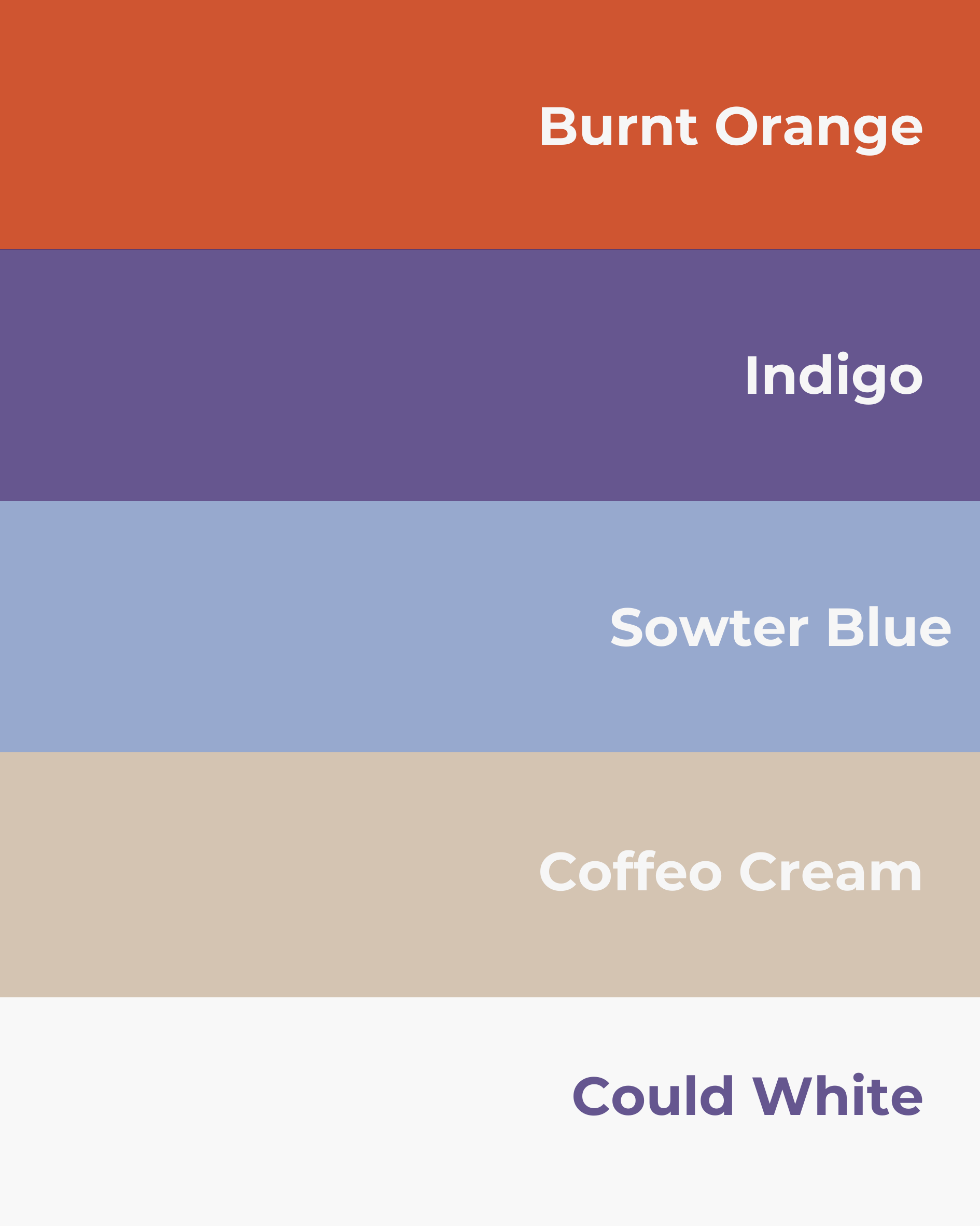
igy needed to speak two languages at once—one that felt playful and approachable to teens, and another that reassured parents with warmth and clarity. The logotype became the heart of the brand: its soft, winding letterforms are more than just friendly—they're symbolic. The “g” and “y” subtly represent a child and adult, with the child nestled or held, echoing the emotional safety at the core of the app. The looping forms suggest two people in conversation, holding hands, staying connected. That metaphor of communication runs through the entire identity—from speech bubble graphics to fluid linework and warm, grounded colours. This brand was designed to break generations of silence, and build trust, reduce tension, and make open conversations feel natural, not forced.